Y Axis
The tool opens with an empty bar chart and data table. You can enter data either by dragging the bars up or down on the chart, or by typing in the data table. You can hide the data table or the chart by clicking on the Show bar chart and Show data table buttons at the bottom right (click again to show the chart or table). Click on the colour swatches in the data table to change the colour of a bar. To label the axes or the whole chart, click on the existing label (e.g. “Click to insert title”) and type your label.
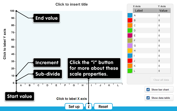
Clicking Set up opens a menu where you can change the number of bars on the x-axis, or change the y-axis scale.
The settings for the y-axis are:
- start value - the lowest number possible within the scale
- end value – the highest number possible within the scale (which must be positive, and greater than the start value)
- increment - this is the gap between the labelled points along the scale. It must work with your chosen start and end values: these determine the range of the scale, and the increment must fit within this range an exact number of times.
- sub-divide - this is the gap between the unlabelled marks within an increment. The increment must be a multiple of this number
The default y-axis, for example, has start = 0, end = 100, increment = 10 and sub-divide = 1.
Click here for more about these settings
Clicking Reset undoes all changes you have made, returning the tool to its default state.
Reset
Are you sure?
Clicking Reset means that any changes you have made will be lost. Is that OK?
ERROR
There has been an error.
Loading assets...