You can rename axis labels by clicking on them.
Add points by clicking on the graph.
You can rename X axis labels by clicking on them.
Add points by clicking on the graph.


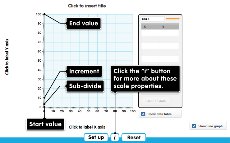
The tool opens to show a graph with x and y axes of 1-100. Add points by clicking on the graph, or by typing in the data table. You can label the axes and the whole graph by clicking on the existing ‘click to label..’ titles.
You can hide the graph or the data table by un-checking the ‘Show data table’ and ‘Show line graph’ buttons.
Clicking ‘Set up’ opens a menu in which you can configure the tool.
- You can have two separate lines on the graph.
- You can change one or both axes to have units in text rather than numbers. Text axes are initially labelled ‘label 1, label 2...’ etc. and you over-type these to change them to your required text values (e.g. March, April, May, June...). Each label must have a unique name - you cannot have two labels called‘Monday’ (you can have ‘Mon 1st’ and ‘Mon 8th’).
- By default, the Y-axis is the same as the X-axis. You can change this by unchecking the button ‘Same as X-axis’
- You can change the units on numerical axes. The settings for numerical axes are:
- start value - the value where this axis crosses the other one
- end value (which must be positive, and greater than the start value)
- increment - this is the gap between the labelled points along the axis, and must fit a whole number of times into the scale
- sub-divide - this is the gap between the unlabelled marks within an increment, and must fit a whole number of times into the increment
The default y-axis, for example, has start = 0, end = 100, increment = 10 and sub-divide = 1.
Click here for more about these settings
Clicking Reset undoes all changes you have made, returning the tool to its default state.
Change axis type
Reset
Are you sure?
Clicking Reset means that any changes you have made will be lost. Is that OK?
ERROR
There has been an error.
Loading assets...